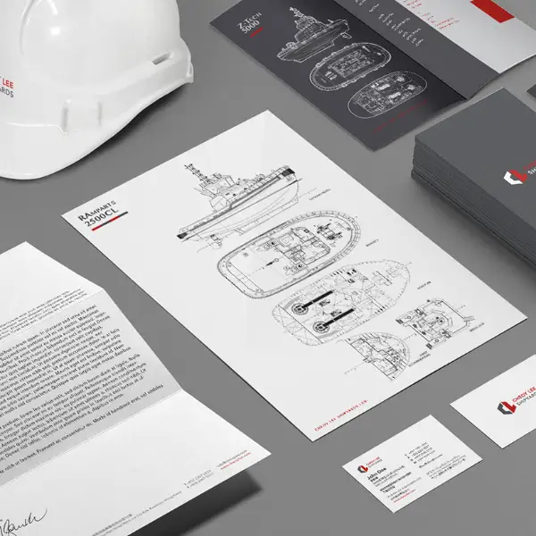
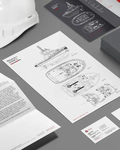
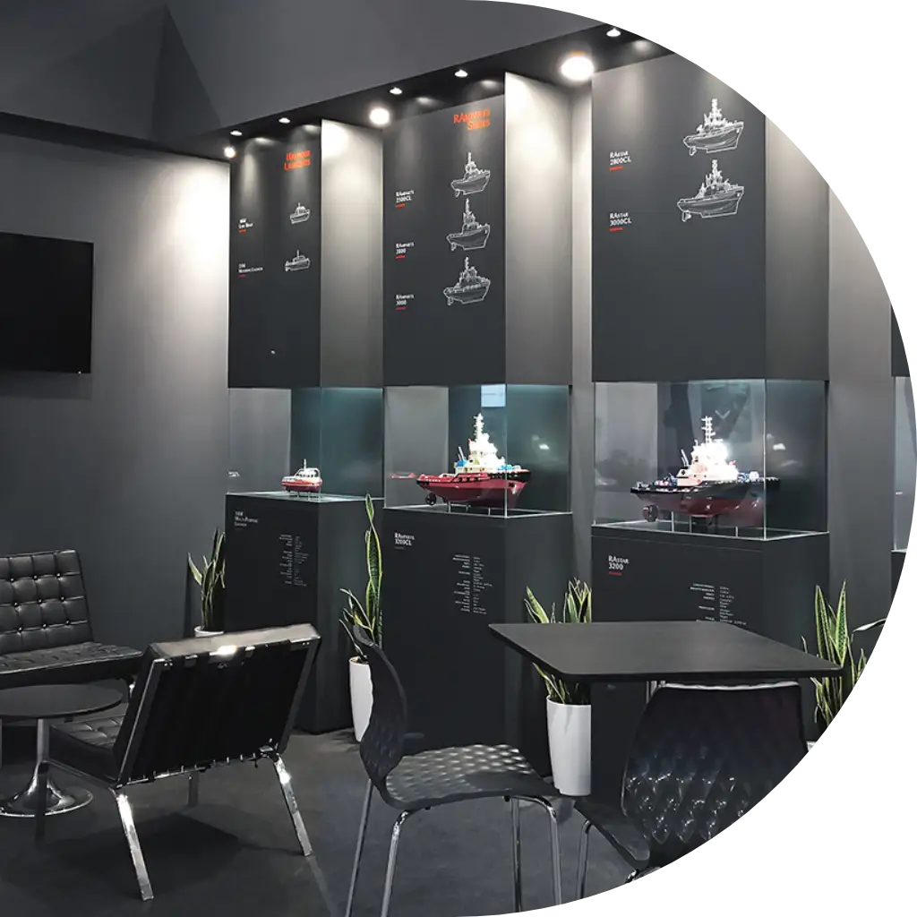
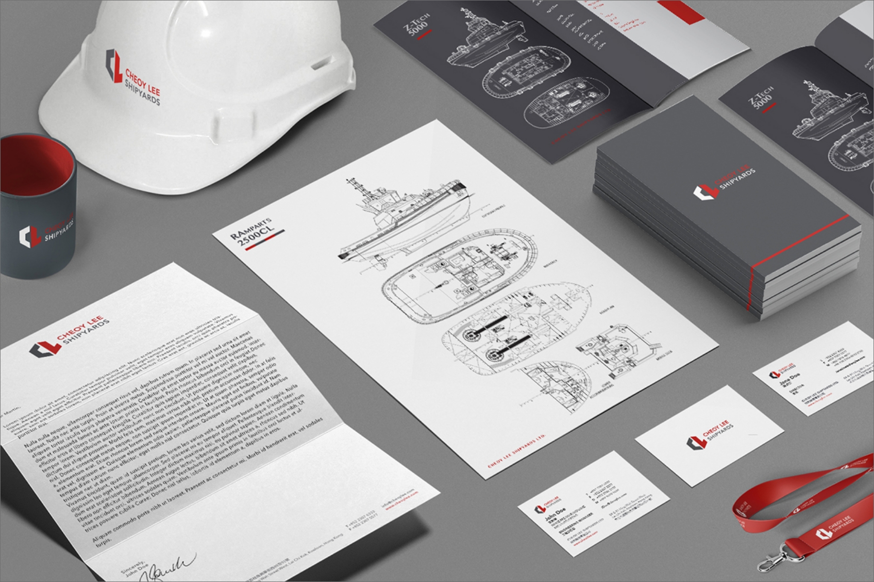
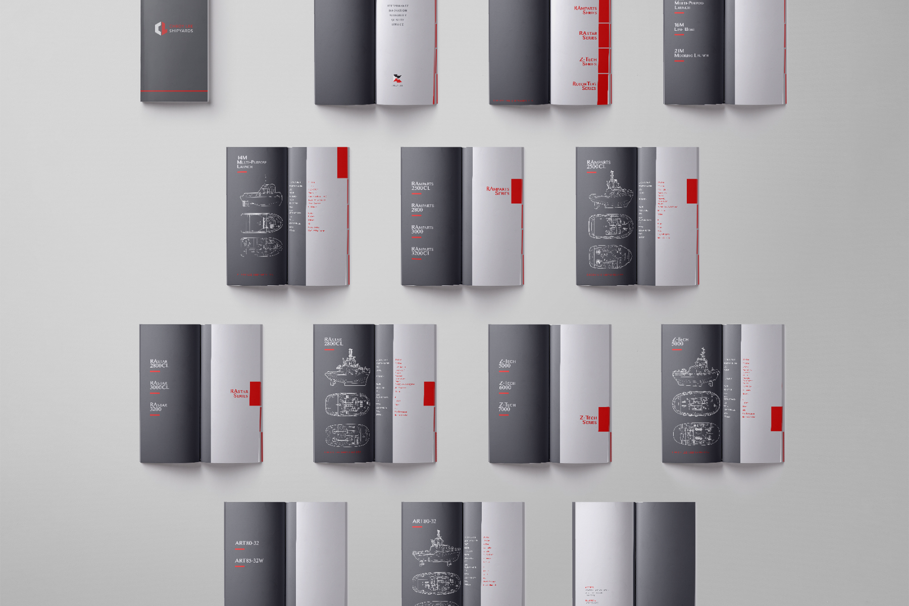
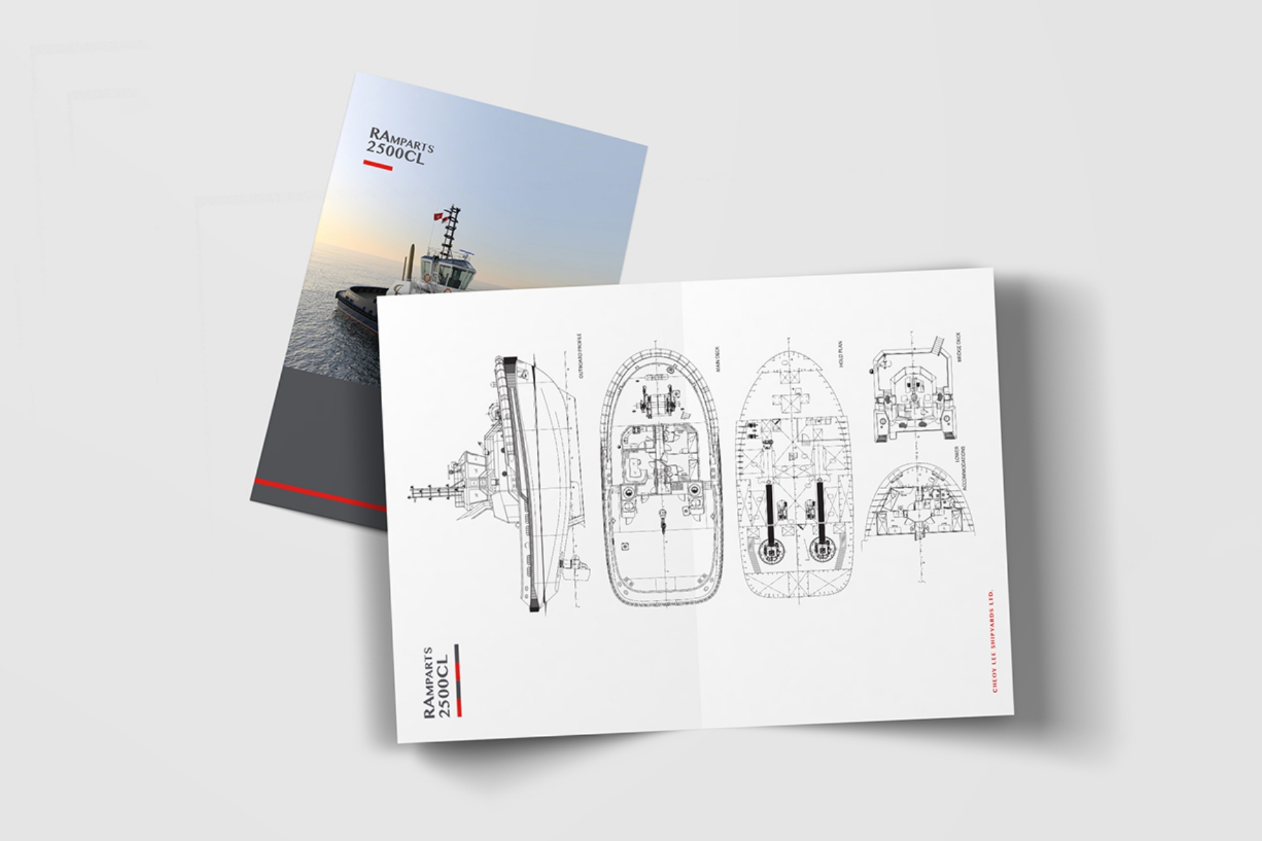
The Cheoy Lee Shipyards logo embodies the brand's unique personality through mindful design targeting their core audience. The hexagonal shape symbolizes strength and reliability while serving as a connecting center of universal coherence, linking heritage with the present through subtle nautical imagery.
Hexagons represent timeless structural stability—their regularity enables infinite repetition while linear symmetry allows perfect load distribution, emphasizing the company's strong, long-lasting, and trustworthy products.
The carefully selected color palette reinforces core values: red conveys passion, confidence, and intensity, while gray represents efficiency, stability, timelessness, and objectivity. Together, these design elements create a cohesive brand identity that communicates Cheoy Lee Shipyards' commitment to excellence and maritime heritage.