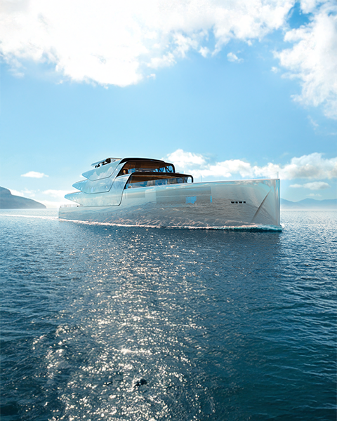
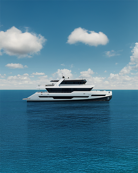
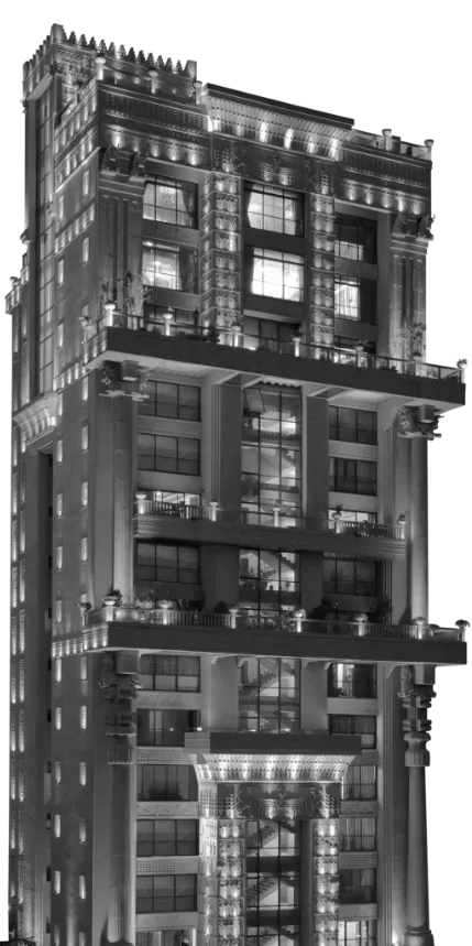
We Design & Build Iconic Projects Invoking A
Sense Of Awe & Inspiration
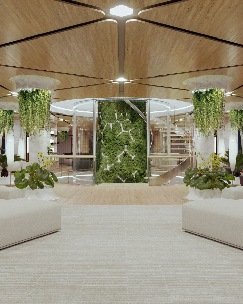
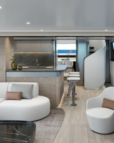
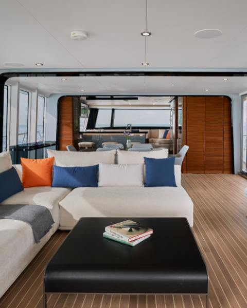
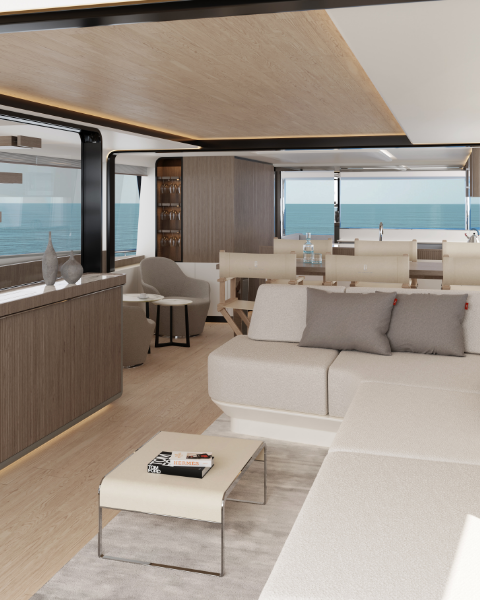
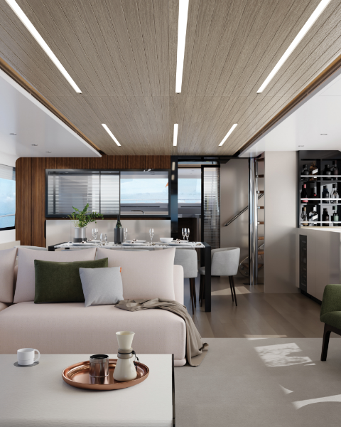
250+ Spaces Reimagined
 Back
Back
Select your profile
(Select ONE to proceed)*
Theme-Based Experiential Hospitality & Adventure Focused Real Estate Developer
10+ Iconic Theme-Based Townships
Back
Select your profile
(Select ONE to proceed)*
The Time Is Now.
Let's Create Some Iconic Destinations
Together
Back